_edited.png)
My first UX
Case Study
Project duration:
May 2023 - July 2023
My Role:
Lead UX Designer
Responsibilities:
Conducting interviews, paper and digital wireframing, low and high-fidelity prototyping, conducting usability studies.
Pixelville is an arcade store that specializes in
providing classic arcade games and experiences.
They also hold special events sometimes that are
fun for a group of friends or the whole family.


Project Name: Pixelville App
We are in the process of transitioning from a traditional booking system to an online booking system, aiming to deliver a seamless and enhanced booking experience for our valued customers. This change will not only benefit our clients but also make our staff's day-to-day operations much smoother, as they can save valuable time previously spent on phone bookings.

Project Overview
The problem:
The traditional booking method takes up a lot of time for both our customers and our staffs.
The goal:
Design an app for Pixelville, let our customer book more easily.

User research
Summary:
I conducted an interview focusing on arcade lovers and people who enjoy attending events.
The user research aimed to understand the needs, preferences, and pain points of potential users for our app. The goal was to identify key features, usability concerns, and overall user expectations to create an intuitive and engaging app experience. The research took place through online interviews with a diverse group of individuals.
The majority of potential users fall within the age group of 16-60. A significant portion of the audience consists of families and groups of friends.

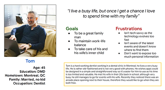
Personas:


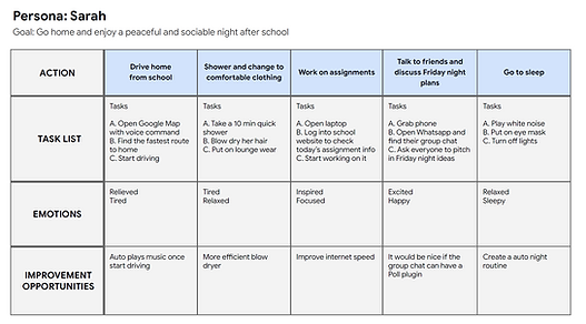
User Journey Map
This is an user journey map of Sarah’s daily routine, we could take a peek at Sarah's personal preferences and characteristics.


Story Board & Hand-drawn Wireframes
Big Picture Storyboard

Close-up Storyboard

Hand-drawn Wireframe
This is an user journey map of Sarah’s daily routine, we could take a peek at Sarah's personal preferences and characteristics.

Digital Wireframes and Lo-Fi Prototypes
The very first wireframes
While turning paper wireframes to digital lo-fi wireframes, I kept the user pain points and suggestions from the user research in mind, and made each page simple, straightforward but functional.
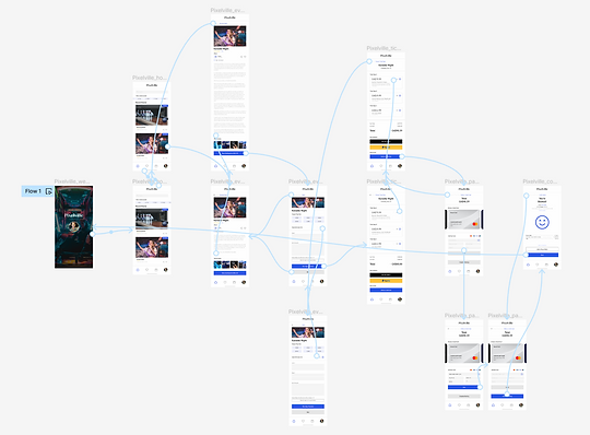
Low-fidelity prototype
This is an example of a successful event booking process. From choosing an event of interest, to viewing the detailed event page, to choose a time slot, to make a payment.

Usability study: findings
I have completed two rounds of usability studies. The initial round targeted arcade enthusiasts and event-goers, who assisted in shaping the app's early development and overall structure. In the second round, I conducted unmoderated user tests with 5 participants, who evaluated the lo-fi prototype. Their valuable feedback guided me in refining the prototype and ultimately creating a hi-fi version.
Round 1 findings
-
Users prefer straightforward booking process.
-
Users wish that there is a reminder function to remind them their upcoming booked events.
Round 2 findings
-
Some are confused about the placement of “Choose a card” and “Add a new card”.
-
Users wish to send confirmation email/texts to their group members.
Affinity Map
An affinity diagram, sometimes also known as a cluster map, is used to organize information and is the output of affinity mapping. Affinity diagrams help organize information into groups of similar items—particularly useful when analyzing qualitative data or observations.


Revised Mock Ups
Before and After Explanations
In the second round of usability study, I noticed the importance of adding a filter to the home page for users to filter events by date. I also realized it is also necessary to incorporate review function.

I have adjusted the layout of the payment page, knowing some users might get confused about having “Choose a Card” and “Add New Card” at the same page. With the help of the new buttons, it should be clear now.

Booking Process - All mock ups

Hi-Fi Prototype

Accessibility considerations
-
We created an clean and intuitive user interface with clear navigation.
-
We used contrasting colors to make text and important elements stand out. We also ensured that fonts are legible and resizable, allowing users to adjust the text size according to their needs.
-
Consistent and Predictable Navigation
-
We avoid time constraints for completing tasks in the app, as some users may require more time to interact with content.

Takeaways
Impact:
Our app will provide an easy way for our users to view upcoming events, and book an event of their choice.
Some testimonies from our participants:
“I like how this app is clear and well-organized, without cluttered irrelevant info/ads, no forced sign-up.”
"I liked the fact that the images take up a big portion of the pages, it's quite nice!"
What I learned:
While designing and refining this app, I learned that conducting usability study is the most helpful step that helps shape an app.
Next Steps
Conduct another usability study since the hi-fi prototype is out, and gather more info and suggestions from participants.
Adding new features if needed.
Thank you!
Thank you for taking the time to read my case study! 😊
If you found the project interesting or have any questions,
please feel free to connect with me on LinkedIn.
Additionally, you can explore my portfolio site to see a collection of my previous projects.
Let's stay connected and continue to inspire each other!
Your feedback and ideas are always welcome :)